Dennae Jones
Graphic Design
Community Lunches
Telostria Branding

This poster and postcard were designed to be particularly eye-catching and attractive to Corcoran students, the targeted audience for this event. Hoping to improve the school community through communal discussions, the advertising for this event needed to catch passing students' attention quickly and drum up interest in following through to attendance.
Spirited Skincare Rebrand
When Spirited Skincare was having a web store built, it was the perfect opportunity to freshen up their brand. The brand's spirit of vitality–seen in their fun product names–wasn't reflected in the minimalistic pale pink and white branding that showed no personality.
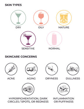
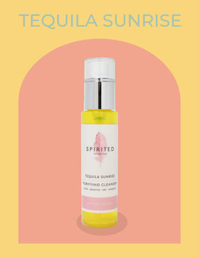
To bring the brand to life, the owner was able to select a new color palette from 11 cocktail-inspired options (still with the core pink) and the branding direction was infused with retro, but clean, detailing. 26 product images were updated from plain white backdrops to deco color-block backgrounds, and a cocktail-based iconography system was created to tag skincare types and concerns for each product. This new imagery served as a structural basis for the website, which could now reflect the brand's playful personality.
Smirnoff Box Packaging

Brand development for Telostria included a complete brand profile (logos, typefaces, color palette) for web implementation, yard signs, business cards, and templates for estimates, contracts, and invoices. The client wanted the brand to be unconventional, a balance of tech & artsy, and lighthearted but contemporary, bold, and honest. Inspiration was taken from the company's name root–Telos–from its ancient Greek origins to its representation to the company founder–the peak of fulfilling a journey or achieving goals.
Dudley Poster
Based on the original sketch (see second image above) by the featured artist, Wendy MacNaughton, a poster was developed for the annual Dudley Memorial Lecture. Watercolor elements were added to the background to reflect Wendy's watercolor drawing style. The title text reflects Wendy's handwriting, while the informational text remains bold and legible.
4K For Cancer
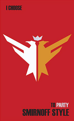
This design is intended as a packaging box for a bottle of holiday-themed Smirnov vodka. Elements such as glitter, a gingerbread man wearing a party hat, and mistletoe were incorporated to create an upbeat, holiday feel. Many Smirnov campaigns feature the slogan “I choose” with varying endings, so this campaign contains the slogan “I choose to party Smirnov style”.
Click on an image to view all four sides of the box in one layout.
Heartland Magazine Redesign
The client, Heartland Magazine, requested a redesign of their magazine, including a new cover and a feature article spread. Their original magazine was on cheap paper, with low-quality images, awkward text placement, and no cohesive design aesthetic. For the redesign, the aesthetic includes large images and subtle cream backgrounds, as opposed to stark black and white. This redesign is meant to feel authentic and still appeal to the agricultural population, but with an updated modern twist.
This project consisted of a poster design, an advertisement design, and a t-shirt design for a bike across America charity project as a part of the Ulman Cancer Fund for Young Adults. This organization’s goal is to raise money and awareness for young adults, and their loved ones, affected by cancer. The poster and advertisement are for the fundraiser, and the t-shirts were sold to raise money for the cause as well. Posters and advertisements were distributed on the UNC-CH campus and school newspaper.
Summer Beer Cheat Sheet
This cheat sheet was created as collateral for customers' use at Purvis Cellars in Melbourne, Australia. It was intended to help customers less familiar with craft beer, as well as showcasing store recommendations for great summer beers. It can be printed on a standard letter size piece of paper on any regular black & white printer.
Click on the image to open larger PDF version.


